YaYa Concepts
flower brandA brand site for a California flower label: the story, the lineup and where to find it. Nothing is sold on the site.
In preview. Not launched yet.
The headache
This is a brand site with no store in it, and the pouch design was already set. The site had to build the brand without selling anything, around packaging that was not going to change.
In the way: The site is not a store.
What I built: It sells nothing. It tells the story, shows the lineup and tells people to ask for it at licensed dispensaries.
In the way: The pouch design was already set.
What I built: I built the site's colours and its first screen around the pouch as it is, so the bag and the page look like one thing.
In the way: A stack of sections reads like a template.
What I built: One idea carries the home page: the pouch stays pinned while the release and the lineup move past it.
In the way: Shops need a way in too.
What I built: There is a stockist link for retailers, apart from the page that tells customers where to find it.
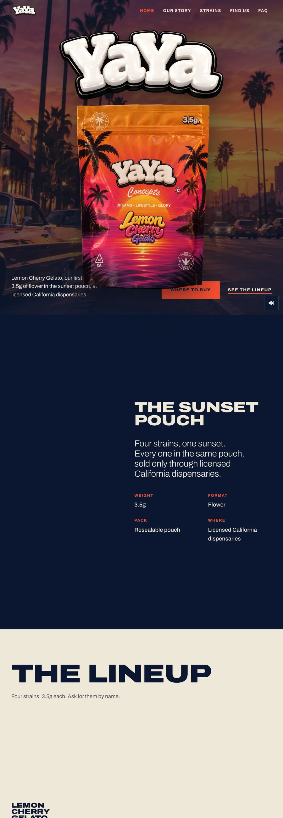
Nothing is sold on this site, so it has one job: make the brand feel like something, then tell people to ask for it at licensed dispensaries. It is nine pages, and the home page is built around a single pouch that stays with you as you scroll.
Up close
The look, and why
Deep navy, #0b1730, with bone type at #efe7d8 and one red-orange, #ff4d2e, for the things to press. The whole site is set in Archivo. The hero is a sunset street under a navy veil with grain over it and the pouch in front, so the page takes its colours from the bag.
What does your website need to do?
Tell me about your business and the project you have in mind.